Wednesday, June 24, 2009

Photoshop Magic

There can be more to creating an image than pulling out paper and paint.

My food blog has presented new challenges in illustration. When cows unexpectedly visited my garden, I wrote a post and need an illustration.

I had a painting of a jersey cow.
And I had a painting of the garden gate.

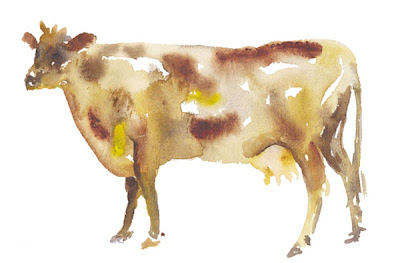
Could I put the cow in the garden using the magic of Photoshop?

I began by creating a file that had the cow as a bottom layer and topped the cow with a garden gate layer. After I adjusted the scale and position of the cow, I selected the cow and erased areas in the garden gate painting where I wanted the cow to appear.

Success!

To read the post on my food blog *click here*

Carol Egbert

Thursday, June 11, 2009

12 x 12 Show - Studio Place Arts

A couple of months ago, I met an artist who suggested that I get involved with SPA. Initially, I thought she was talking about a place for massages and saunas.

After clearing the confusion, and learning more about her show last winter at Studio Place Arts in Barre, Vermont, I visited their website with the intention of becoming a gallery member.

The Call to Artists section of the website had details about submissions for the upcoming '12 x 12' Show. On the wall near my desk hung three 12" x 12" oil paintings. Serendipity!

Rather than simply joining SPA, I decided to submit paintings for the show. The process was pretty simple, and with no expectations, I sent off the application later that day.

Two weeks later, the 'We are pleased to include .....' letter arrived.

Yesterday, I delivered two paintings. I'm looking forward to the opening reception Friday, June 19th from 5:30 to 7:30. The show will hang from June 16 through July 25th in the Second Floor Gallery.

To visit the Studio Place website +click here+.

My trip to Barre also included a delightful surprise called LACE. To read about it - visit my food blog by +clicking here+.

Tuesday, May 26, 2009

Yellow

Sunshine, lemons, buttercups, gingko leaves, butterflies, pears - the beginning of a list.

What do you think of when you think of  YELLOW?

Thursday, May 14, 2009

Blue


Painting refines my eye and makes more visually aware. A word like 'blue' opens the door to infinite possibilities.

On sunny, cloudless days, at the horizon the sky is cerulean blue and directly overhead it is cobalt blue.

Prussian blue is important when painting blueberries and blackberries.

Chicory flowers range from cobalt, to periwinkle, to baby blue.

Blue eyes have flecks of silver or green.

Dark veins on leaves have touches of ultramarine.

Shadows painted with blues bring life to a painting.

Cerulean, cobalt, and ultramarine are always on my palette. I keep manganese, Prussian, and pthalo close at hand. 

To see some of my paintings ***click here***

Thursday, May 7, 2009

Painting in Progress


I've been working on this painting for the last couple of days. I wanted to work with whites, yellow whites, pink whites and blue whites.

This painting is in a state of  'middleness' - a time of judging and editing.  Should the flower that is falling off the left side of the canvas go away?  how much darker can I make the background? should I use a cloudy white glaze on the table? which white will be the best for the bright white highlight needed on the vase? 

The process of paintings, like all creative endeavors, is an inverted arc.  At the start, the image is clear in my mind, my goals straightforward and exciting.  In the middle the image has become confusing, my goals unclear and it is a struggle to finish.  

Another point of view is helpful, a postive response is even better - so with a very wet painting in hand I walk out to Charles' studio and get both, plus some constructive critism.  

I'll let the paint dry a bit, incorporate his suggestions and finish this painting, hopefully arriving at the end of the creative arc pleased with what I have done.  

Meanwhile I've begun a new yellow house painting.  

Tuesday, May 5, 2009

Oil Pastels

Since returning from the Vermont Studio Center, in my struggles with the issue of creativity,  I have been experimenting with a variety of media.  

Yesterday, a wooden box of 120 Sennelier pastels arrived in my studio.  With a wide color range and wonderful creamy texture these pastels are luxurious to work with.

This painting was inspired by nearby fields and the countryside near Tolousse.   

Monday, May 4, 2009

Bookstock Poster

Creating  art for an event run by a committee is an ongoing process.  With the possibility of selling tee-shirts and/or canvas bags as an additional money raiser and means of promoting the festival, and because one color printing is much more economical, I wanted to created a sepia version of the Bookstock poster.

I began with the color art and using Photoshop, I removed the color, adjusted the contrast, colorized the image and in a few minutes had a monochromatic poster.

Saturday, May 2, 2009

Pears, Pears, Pears........

An explanation of  why my avatar is a group of pears. 
I worked with clay, made  jewelry, created quilts and other needlework, before  I was inspired by a package from my mother. She sent me nine tubes of watercolor paints and a note, ' Give it a try.' 

I bought watercolor paper, a few brushes and a number of books and began to paint.  A pear seemed like a good subject - its form is recognizable even if not expertly rendered.  An apple might be mistaken for a tomato or pepper but pears are pears.  One pear led to another.  I enjoyed the challenge of painting a pear that transitioned from red to green with pink, orange and yellow in between.

Big, small, lumpy, round, elongated, red, green, maroon, without noticing, for nearly a year I painted only pears.
Now I paint with both oil and watercolor and create all sorts of paintings, but if I'm stuck, stumped by a blank piece of paper or an empty canvas, often a pear or group of pears appear.

This is the painting for the first in my series of fruit note cards.
 To purchase note cards  ***click here***

Thursday, April 30, 2009

Trying a New Medium

Yesterday, I spent the day experimenting with oil pastels that I bought recently to fill the time on a long train trip home from Washington, DC to Vermont. Unlike soft pastels, there is no need use a fixative so I was able to work without filling the air with nasty chemicals.

Back in my studio, I pulled them out again.  I began drawing on paper, tried a canvas board, a small stretched canvas and then a piece of pine.  The surface of the pine board was most pleasing.  I created an under painting with shades of red, orange, and yellow before creating the landscape.  With the drawing finished, I used brushes and Qtips to apply both linseed oil and walnut oil in order to further blend the colors. The oils give the finished piece the look of an oil paintings.

Inspired by the vibrant colors, I ordered a proper set of artist quality oil pastels.      To be continued!


Tuesday, April 21, 2009

To Market, To Market

Creating a painting is only one part of being an artist.  Getting painting out into the world is another.. With that in mind I have decided to submit three  paintings for consideration to Studio Place Arts in Barre, Vermont for their upcoming 12 x 12 (inches) show that will run from June 16 through July 25.

These flowers were painted at the Vermont Studio Center during my January residency. 

The Vermont Studio Center in Johnson, Vermont is a place like no other,  an artists' colony where visual artist and writers  work, recharge their creative battery, and live in community. 

While there,  I began to work with soft pastels, created small sculptures with found material, (including the beetle I posted earlier, worked on a series of oil paintings, including this one, painted with a very dark pallet, ate incredible meals, had wonderful conversations with many residents and returned home energized, inspired and rested. 
 

Saturday, April 18, 2009

Completed Poster


With an image chosen, the landscape inspired by a valley in France, I turned to my computer and Photoshop to create the logo.

I began by cropping  and adding the dark border.  I tried a number of filters and settled on the Artistic filter surprisingly called --- Poster!

Then I spot edited the image, removing excessive dark spots and lightening the sky.

I used the font called Matisse because it conveyed the spirit of the event and worked well with image.

My husband, Charles, suggested that the house in the foreground should 'go away' and the field behind the text be lightened.  With that accomplished through the magic of cloning and selective color replacement, I added a credit line and declared the logo finished, at least until it is reviewed by the Bookstock planning committee.

Start a Poster


I am designing the logo for Bookstock: The Green Mountain Festival of Words.  A collaboration of the Norman Williams Library, The Historical Society, Pentangle, The North Universalist Chapel Society, The Thompson Center, and other community organizations in Woodstock, Vermont. There will be upwards of fifteen literary events, in a number of venues in the village of Woodstock, during the first weekend in August. 

My process began with a search for images of books, mountains and valleys.  I looked at clip art and played with text.  Unsatisfied by what I found, I turned to digital images of my oil paintings and was inspired by the  landscape of a valley in France posted above. Now its time to turn to my computer and Photoshop.  

I'll post the final image, at least final for the moment, when I'm satisfied. 

Sunday, March 29, 2009

Spring Renovation


We have a classic revival porch on the west side of our house but it is close to the road and shaded by the hillside, we have a terrace that faces the pond and view of the hills but ants litter the stones with sand and crawl on my toes,  I thought we needed a new porch.  After much discussion, I convinced my husband and then I changed my mind.  

Small is better, we don't need to add another square foot of space to our house, let's make what we have serve our needs. We began in what had been a laundry room and half bath. It has been transformed into a powder room with a separate laundry closet.  Often the most important part of a renovation project is subtraction rather than addition;  we removed ceramic tile, cement board, linoleum, and tar paper and uncovered a hardwood floor. We replaced a brown, faux marble, scallop shell sink, with a simple, white porcelain, pedestal sink.  This small chair found in Singapore has become a shelf and towel bar in the redone powder room.

Tuesday, March 24, 2009

Orange Beetle


I spent the month of January at the Vermont Studio Center in Johnson, Vermont recharging my creative battery and spending time with a diverse group of visual artists and writers.

One morning, on the way to my studio, I found molded paper packing material.  Inspired by its shape, I used soft pastels to created this beetle. 

Sunday, March 22, 2009

Spring Snow

Today I began to think about my garden and as I was thinking loads of fluffy white stuff began to fill the air.  Pollen perhaps? Dandruff from above? Nooooooooo. A friend called it 'poor man's fertilizer'.

It may be too cold to plant but it's never too cold to plan. Last summer I planted vegetables among the flowers - parsley and feathery carrot tops bordered roses and cone flowers, onions served as row markers, the beets were hearty, the green beans and lettuce were sparse and the spinach was a no-show so I need a new game plan.

Potatoes, tomatoes, dill, onions and patty pan squash are on my list, at least for today, I'll see what tomorrow brings!

Saturday, March 21, 2009

River Road Studio

Flowers appear in the spring, lambs are born in the spring, sugaring has begun here in Vermont and I have decided to dip a toe into the blog world.